Bloom Grid
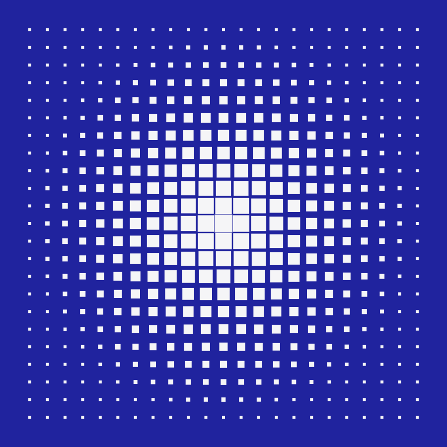
Pressure released from the centre — the grid exhales in white.
About the piece
Bloom Grid is the most borrowed image in the studio — it has fronted a festival identity, a book cover and two living-room walls I know of. The recipe is simple: a strict grid of squares on royal blue, each one swelling in proportion to its distance from a calm white heart.
It works because it holds two ideas at once: total order at the edges, total release in the middle.
Details
The edition is screen-printed in two passes — a deep cobalt ground, then opaque white — so the centre has a physical lift you can feel with a fingertip.
The motif is also licensed for identity and packaging work; the geometry scales from favicon to facade without losing its nerve.
Fix the grid
Twenty-three squared, margins held, no exceptions at the border.
Release the centre
Square size follows distance from middle — pressure mapped to area.
Two-pass print
Cobalt ground, opaque white over — proofed until the heart glows.
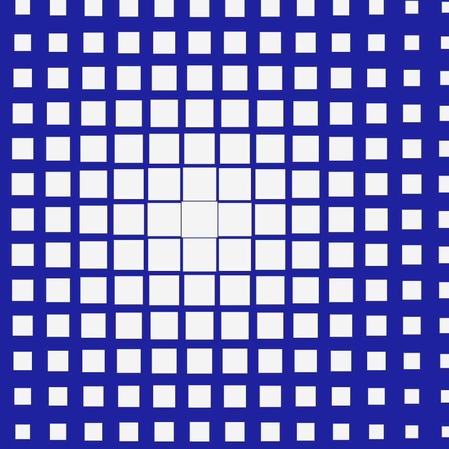

“The Bloom cover doubled our pre-orders. People photographed it in bookshops — you can’t buy that kind of attention.” — Ingrid Solberg, art director, Fjord Press
Related projects

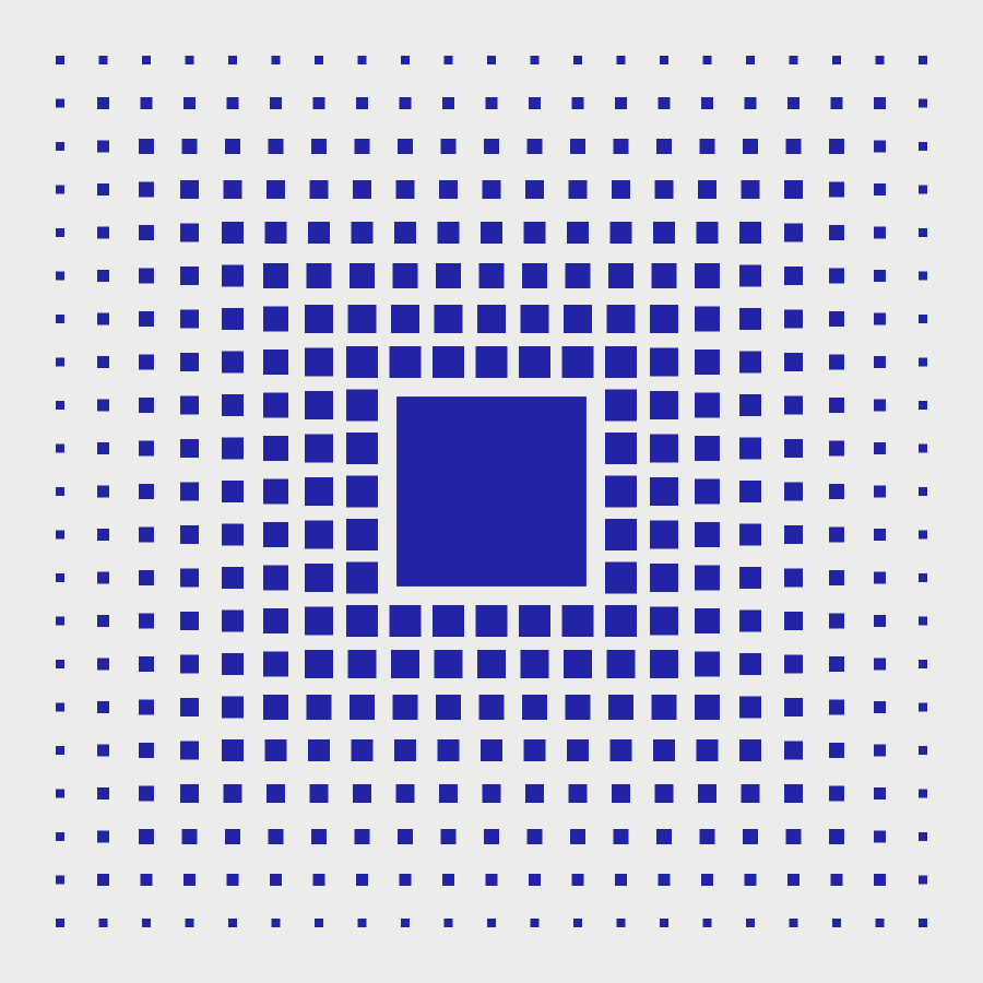
Borrow the Bloom
Prints in three sizes, plus licensing for covers, identities and packaging.